Every Point on This Rainfall Chart Represents a Decade. Except One.
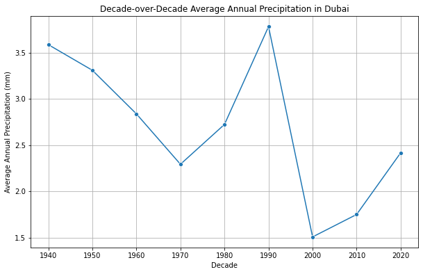
A decade-over-decade chart implies its points are the same kind of thing — nine averages, each built from the same ten years, differing only in when those ten years fell. That assumption is usually safe. It wasn't quite true here:
"How has precipitation changed decade-over-decade in Dubai?"
VerbaGPT queried Dubai's monthly precipitation from the MonthlyData table (ERA5 reanalysis, 19 cities, January 1940 through December 2025) in an Azure SQL Server database, summed each year's twelve months into an annual total, then averaged those annual totals within each calendar decade:
| Decade | Avg. Annual Precipitation (mm) | Years Averaged |
|---|---|---|
| 1940s | 3.59 | 10 |
| 1950s | 3.31 | 10 |
| 1960s | 2.84 | 10 |
| 1970s | 2.29 | 10 |
| 1980s | 2.72 | 10 |
| 1990s | 3.78 | 10 |
| 2000s | 1.51 | 10 |
| 2010s | 1.75 | 10 |
| 2020s | 2.42 | 6 |
The last column is the one the chart doesn't show. Eight of these nine points are ten-year averages. The ninth — 2020s — is a six-year average, because the data ends in December 2025. On the chart above, it's plotted at the same size, the same spacing, the same visual authority as every full decade next to it. Nothing marks it as a different kind of number.
Why the Missing 40% Matters More Here Than Usual
For a lot of variables, a 6-year sample versus a 10-year sample is a rounding error. Desert precipitation isn't one of those variables. Rainfall in a hyper-arid climate like Dubai's is a classic heavy-tailed series — most years contribute almost nothing, and the annual total is disproportionately set by however many unusually wet years happen to land inside the window. A decade average of ten years gets some protection from that skew simply by having more draws. A six-year window has 40% less protection against the exact same skew, at the exact moment the chart is asking it to represent a full decade.
That doesn't make the 2.42mm figure wrong — it's a correct average of the six years on record. It means that number carries meaningfully more uncertainty than the 3.78mm or 1.51mm on either side of it, and the "rising again in the 2020s" read in VerbaGPT's own summary of this data is a read of a thinner, noisier sample than the trend it's being compared against. The chart has no way to communicate that difference visually — a decade point is a decade point, whether it's built from ten years or six.
The other thing worth noticing without needing a statistical test: the highest decade in this 85-year series isn't the earliest one. The 1940s (3.59mm) sits fourth. The 1990s (3.78mm) is the actual peak, 5% above even the 1940s baseline, right in the middle of a series that also contains the driest decade on record twenty years later (2000s, 1.51mm — a 60% drop from the 1990s peak in one decade transition). Whatever is driving this series, it isn't a straight line, and averaging by decade doesn't fit a trend so much as it draws nine dots and lets the reader's eye connect them into one.
VerbaGPT's own built-in notes for this dataset actually anticipate this exact problem: they flag that climate variables are frequently non-normal and heavy-tailed, and recommend Sen's slope or a Mann-Kendall test — non-parametric methods built for series like this one — over a plain average when the question calls for a real trend. That guidance exists because an earlier weather analysis on this same dataset got the identical piece of feedback from a human reviewer and it was captured for future runs. This particular query, generated fresh by Gemma 4 31b off a gpt-oss-120b schema pass (both on Cerebras, no prior similar question to reuse this time, the SQL and plot executing in 362ms), read "decade-over-decade" as a request for decade averages and answered exactly that — correctly, but without reaching for the trend test sitting in its own instructions one level up.
None of this is specific to Dubai or to rainfall. Any time-bucketed chart built from a data window that doesn't divide evenly into the bucket size — a "this year" bucket run in July, a "this quarter" pulled mid-quarter, a fiscal year cut short by a system migration — has the same silent asterisk sitting on its last point. The question worth asking of your own dashboards is the same one this chart doesn't answer on its own: does every point represent the same amount of underlying data, and if not, does the chart say so?
Data source: ECMWF ERA5 reanalysis, single-level monthly means, Dubai precipitation, January 1940–December 2025. One of VerbaGPT's built-in sample datasources.
Ask your own question about this dataset → The ERA5 weather datasource is live and open — no signup required for a few questions.
Related
This Group Has the Highest Average Health Spending and the Lowest Typical Spending
Inside China's "Rapid Expansion" Phase, One Five-Year Stretch Barely Grew at All
Agent Skills in LLMs: A Weather Analysis Case Study
One of the Top 10 "Asthma Drugs" in This Query Wasn't a Drug At All
Back Pain Diagnoses Dropped in 2020. Anxiety Diagnoses Never Paused.