This Group Has the Highest Average Health Spending and the Lowest Typical Spending
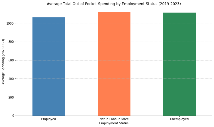
A bar chart of group averages answers one specific question — what does the typical dollar in each group look like — and quietly assumes that "typical dollar" and "typical person" point the same direction. They don't have to. Here they point in opposite directions for all three groups at once:
"How does employment status correlate with total out-of-pocket spending?"
VerbaGPT pulled employment status and total out-of-pocket spending from MEPS's person-level table, adjusted every dollar to 2026 terms, and computed both the weighted mean and the weighted median for three groups — employed, unemployed, and not in the labor force — across the pooled 2019–2023 sample:
| Employment Status | Mean | Median | Mean ÷ Median | Sample Size |
|---|---|---|---|---|
| Employed | $1,060.94 | $238.16 | 4.45× | 55,027 |
| Unemployed | $1,113.27 | $214.83 | 5.18× | 501 |
| Not in Labour Force | $1,120.13 | $160.86 | 6.96× | 1,345 |
The bar chart above only plots the first column, and it looks almost flat — the three means sit within 5.6% of each other. Read on its own, that chart says employment status barely matters. The rest of the table says something closer to the opposite.
The Ranking Flips Depending on Which Number You Read
By the mean, "Not in Labour Force" is the highest-spending group — $1,120.13, the most of the three. By the median, it's the lowest — $160.86, a full 48% below the employed group's median of $238.16. Employed people spend the least on average and the most typically. Not-in-labor-force people spend the most on average and the least typically. Every ranking in this table inverts depending on which statistic you read, and a chart of means alone can only show you one of the two stories.
The mean-to-median ratio makes the shape of the gap explicit: for employed people, the mean is 4.45 times the median — already evidence of a right-skewed distribution, where a minority of high-cost cases pull the average well above what most people actually pay. For the not-in-labor-force group, that ratio is 6.96 — meaningfully more skewed. A relatively small share of catastrophically expensive spenders in that group is doing more work to inflate its average than the equivalent share does in the employed group, while the group's typical member pays less out of pocket than a typical employed person does.
One plausible reason, consistent with how U.S. coverage is structured rather than confirmed directly by this query: "not in labor force" bundles retirees and people out of work due to disability or chronic illness — many covered by Medicare or Medicaid, both of which carry little or no point-of-service cost-sharing for routine care, which would push a typical member's bill toward zero. Employed people are disproportionately on employer-sponsored private insurance, which more often carries real deductibles and copays for routine visits — pushing a typical employed person's bill up even though the group as a whole is healthier by the basic fact of being well enough to work. The small number of severely ill people inside the non-labor-force group, meanwhile, can carry expenses large enough to dominate that group's mean despite their tiny share of it.
This exact question had been asked before — the thumbs-up match on this run was a perfect 1.00, meaning the working code that produced this table was reused directly from a prior approved run rather than generated fresh, schema resolution finished in 1.7 seconds on gpt-oss-120b, and the actual query, weighting, and median calculation executed in 3.3 seconds via Zai GLM 5.2 on OpenRouter.
The general lesson travels well past employment status or health spending: any time a metric is dominated by a skewed distribution — spend, latency, support-ticket resolution time, deal size — the group with the highest average is not necessarily the group where a typical case is expensive, and a bar chart of averages will tell you the average's story only. The moment a "correlates with" question involves money, time, or anything else that clusters near zero with a long tail, the median next to the mean isn't an optional extra column — it's the column that can reverse the headline.
Data source: Medical Expenditure Panel Survey (MEPS), person-level employment status and out-of-pocket spending, pooled 2019–2023 (AHRQ). One of VerbaGPT's built-in sample datasources.
Ask your own question about this dataset → The MEPS datasource is live and open — no signup required for a few questions.
Related
The Income Group With the Lowest GLP-1 Use Isn't the Poorest One
GLP-1 Spending Nearly Quadrupled. Cost Per Patient Peaked in 2021.
Every Point on This Rainfall Chart Represents a Decade. Except One.
Mild Diabetes Is Overpriced. Severe Diabetes Is Underpriced. Same Risk Score.