The Income Group With the Lowest GLP-1 Use Isn't the Poorest One
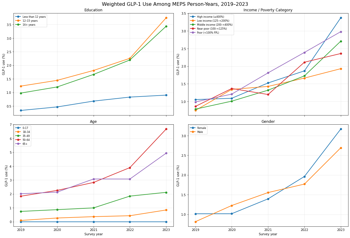
An expensive new drug class becoming more common usually maps to a simple story: the wealthier you are, the sooner you get access, the poorer you are, the longer you wait. That story holds for the two ends of the income spectrum here. It breaks in the middle:
"I'd like to understand GLP-1 use over the years in terms of education and income and age/gender. Give me visuals where helpful."
VerbaGPT tracked GLP-1 prescription fills (semaglutide, liraglutide, dulaglutide, exenatide, tirzepatide) across 113,267 MEPS person-years from 2019–2023, weighted to national population estimates, and split the trend five ways: education, income (by federal poverty level), age, and gender. Three of those four break down the way you'd expect — use rises with age up to the 50–64 bracket, rises with years of education, and only modestly differs by gender. Income doesn't cooperate:
| Income Bracket | 2019 | 2021 | 2023 |
|---|---|---|---|
| Poor (<100% FPL) | 0.99% | 1.81% | 2.98% |
| Near poor (100–<125% FPL) | 0.86% | 1.20% | 2.36% |
| Low income (125–<200% FPL) | 0.74% | 1.43% | 1.93% |
| Middle income (200–<400% FPL) | 0.78% | 1.32% | 2.71% |
| High income (≥400% FPL) | 1.05% | 1.52% | 3.38% |
The Trough in the Middle
By 2023, the highest-income bracket has the highest GLP-1 use (3.38%) and the lowest-income bracket ("Poor," under 100% of the federal poverty line) has the second-highest (2.98%) — ahead of three brackets that all sit above it on the income ladder. "Low income" (125–200% FPL), sandwiched in the middle-low range, has the lowest rate of any group in the entire chart at 1.93% — behind the poor, behind the near-poor directly below it, and less than 60% of the high-income rate sitting above it. This isn't a one-year blip: Low income is at or near the bottom of the five brackets in four of the five years measured, and in 2021, the poorest group actually had higher use (1.81%) than the wealthiest one (1.52%) — a full reversal of the "money buys access" assumption, in the one year you'd expect it to hold most cleanly.
None of this is proof of a specific mechanism — MEPS's income variable here is a poverty-level category, not an insurance-type field, so this is a plausible read rather than a confirmed one. But the shape lines up with a well-documented feature of U.S. coverage: Medicaid eligibility for adults commonly extends to roughly 138% of the federal poverty line in expansion states, which would put most of the "Poor" bracket and a meaningful share of "Near poor" inside Medicaid, a program that has increasingly covered GLP-1s for diabetes and, in a growing number of states, weight management. The "Low income" bracket sits squarely in the range too well-off for Medicaid in many states, and not well-off enough to easily absorb list-price cost-sharing on a marketplace or employer plan — the same income band health-policy researchers already flag as a coverage gap for other high-cost drug classes. The data doesn't say that's the reason. It does say the group that should, by a "richer people get it first" reading, land solidly in the middle of five brackets instead lands at the bottom of all of them.
This run stitched together three separate queries — a GLP-1 drug-name lookup, a person-level demographic pull filtered to valid age, education, income, and sex codes, and a fill-count join — before splitting the merged 113,267-row table four ways and drawing all four charts in one pass. Schema resolution ran on gpt-oss-120b; the code itself, including the four-panel figure, came from GPT 5.6 Luna via OpenRouter, a different model than generated the spending-trend version of this same dataset; the full query-and-plot sequence executed in 5.5 seconds.
The general lesson isn't about GLP-1s specifically: any time a resource is distributed across an ordered scale — income, tenure, company size — it's worth checking whether "more of the scale variable" actually predicts "more access," rather than assuming it does because the two extremes look like they confirm it. A chart with only a top bracket and a bottom bracket would have told the expected story here. The bracket in between is where it stopped being true, and that's exactly the point a two-category summary would never surface.
Data source: Medical Expenditure Panel Survey (MEPS), person-level demographics and prescription fills, pooled 2019–2023 (AHRQ). One of VerbaGPT's built-in sample datasources.
Ask your own question about this dataset → The MEPS datasource is live and open — no signup required for a few questions.